I know it's been a while since I've posted, I'm sorry about the delay. Pearl Painting has been busy, like the proverbial bee. Since there is a crisp "fallness" in the air, people must be thinking about sprucing up their homes / businesses. (Did you like "Fallness"? I just totally made that up!)
Ok so I get a lot of calls from folks who want to change their living spaces by altering color but they don't really know what color they want. I get a lot of requests to make the room "warmer" or "energetic" or "calm". These are a good start for the atmosphere you want to create, but it only just made me realize how difficult it is for people to make the choice and they look to me to help them make the color decision. While that is flattering, I am hesitant to suggest colors as my taste may not be your taste. Even though I have sublime taste. So I have a few Pearl Painting tested and proven hints to help you make a decision on the colors you chose for your home.
First off, check out a color wheel. Look at it, learn it, love it - but most importantly - make it translate to your lifestyle and to the atmosphere you want to cultivate in your home. Here is a base color wheel:
Ok so I get a lot of calls from folks who want to change their living spaces by altering color but they don't really know what color they want. I get a lot of requests to make the room "warmer" or "energetic" or "calm". These are a good start for the atmosphere you want to create, but it only just made me realize how difficult it is for people to make the choice and they look to me to help them make the color decision. While that is flattering, I am hesitant to suggest colors as my taste may not be your taste. Even though I have sublime taste. So I have a few Pearl Painting tested and proven hints to help you make a decision on the colors you chose for your home.
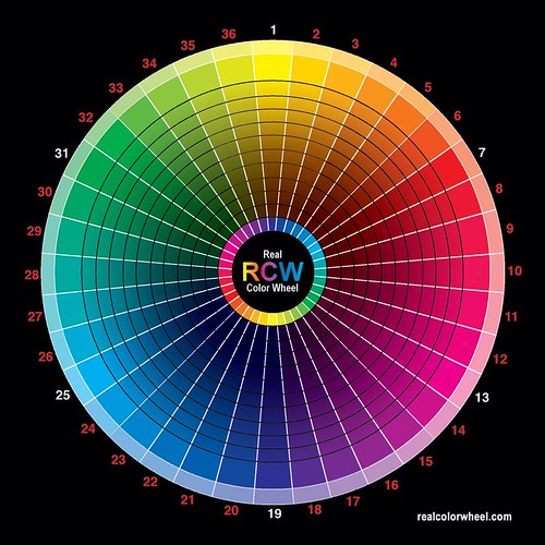
First off, check out a color wheel. Look at it, learn it, love it - but most importantly - make it translate to your lifestyle and to the atmosphere you want to cultivate in your home. Here is a base color wheel:
 And while it is simple enough, it shows the main colors in our spectrum "Roy G. Biv" which stands for Red Orange Yellow Green Blue Indigo Violet, among others. The basic color wheel is comprised of 3 parts:
1. Primary Colors - Blue, Red, Yellow which are colors that cannot be made by mixing the other hues together.
2. Secondary Colors - Mix an equal part of two Primary Colors and you’ll get the three Secondary Colors: orange, green and violet. Mix yellow with blue and you get green, and so on.
3. Tertiary Colors - These colors, made when you mix a primary with a secondary color. The result is a hue like red-violet, or yellow-green.
One way to help you define a color you like is to identify things your eye is drawn to - an apple, leather, a flower - once you know items you like make a list. Divvy up the list into the appropriate color on the wheel - and whatever majority is in whatever color - you now have a start. So if you happen to have corn, eggplant, raspberries, pomegranate and watermelon - well clearly you have a trend towards red shades. Obviously you don't have to be pegged with red when there are hundreds of shades of red to consider, it is only a jumping off point for you, but at least you know you are drawn to it so it's a somewhat safe choice for you.
So the above simple color wheel is a twelve-color wheel; you can make many more hues by mixing colors in different proportions. And when you find the hue you are drawn to, if you add white or black to that hue you will create a different values or tone, that are lighter (a tint) or darker (a shade). And you can choose colors where the hue is more or less intense; this is called the saturation or chroma. More saturated colors are more pure hues and less saturated colors are more gray versions. (Got that lovely explanation here - thanks homeworkshop.com!)
So that helps explain why designers have much more detailed color wheels - to help you find that "cool" color, to compliment the "vibrant" on you have your heart set on.
Pour example:
So with this as a start in a later pose we can get into color theory , and why some colors work well together, but it’s just as important to choose colors that “feel right” to you. After all, you’ll be the one living in the space.
And I think I will save the rant on color names - I mean Behr 7405 is the shade I have in one of my bedrooms - but does the name "Leather Suede" mean anything to you? Yeah, me either. But it's a kick-ass color.
And that dear reader, is another post, for another time when my eyes aren't hanging out of my head and my body is begging for a good night's sleep.
Anyone out there own a Tempurpedic Cloud? I am truly gagging for one of those.
"Q"
No comments:
Post a Comment